GNOME Shell and Unity are the two new approaches towards creating the ultimate desktop experience by GNOME Foundation and Canonical respectively. Both approaches stirred up fair amount of controversies, with personalities like Linus Torvalds going so far as to call GNOME Shell an unholy mess. But things aren't that bad, or are they? Let's find out.

GNOME Shell in Ubuntu 11.10 Oneiric Ocelot Review
GNOME foundation is still receiving a lot of flak for its new shell for GNOME 3.0 called GNOME Shell. Ever since it was released, I wanted to install and try it out in my Ubuntu so badly. But it was not so easy until Ubuntu itself upgraded its underlying platform from GNOME 2.0 to GNOME 3.0. GNOME Shell is now availble in the default repositories of Ubuntu 11.10 Oneiric Ocelot, which is less than a month away from its final release.
Meanwhile, Ubuntu's own Unity interface is changing drastically. We highlighted important changes for upcoming Ubuntu 11.10 sometime before, but I think the very availbility of GNOME Shell dwarfs all other changes in terms of importance. Because instead of one simple GNOME interface, now you have two, each one unique and special in its own way. Unity has been the topic of choice for long here, now lets start learning GNOME Shell.
GNOME Shell - First Impressions
Installating GNOME Shell is very simple now, just search for 'GNOME Shell' in Ubuntu Software Center and install the package. After reboot, you will see a new entry with the name 'GNOME' along with 'Ubuntu' and 'Ubuntu 2D' in the LightDM login screen. Enter the required credentials and you are ready to go.

The original GNOME Shell desktop is rather too simple IMO. You are greeted with a plain screen with no visual cues on how to get started. If you are not a seasoned GNOME user and didn't follow the development of GNOME Shell actively, getting started is going to be tricky.
After logging in, I was bombarded with all kinds of application crashes, which is to be expected from a pre release distro. But there was something really odd about it - notifications.

Yes, that's right. "Application problem is ready" was the notification. This can be quite confusing for a new user. More troublesome was the notification functionality itself. Once the warning pops up, there is no clue on how to make it go away. After living with GNOME Shell for a few days, I was sure of one thing. Notification feature of both Unity and GNOME shell needs a lot of work. Hope the next GNOME 3.2 update will bring about necessary changes.
GNOME Shell Look & Feel
GNOME Shell with the default Ubuntu theme looks plain ugly. See, I am not someone who can't stand brown color scheme. But the default Ambiance theme is just not the one for GNOME Shell. On the other hand, Unity looks clean and professional with its default setup. GNOME Shell themes are available in plenty already, so there is nothing to worry. Download the one you like, install and you are ready to go.

Above is Drakfire Zuki GTK3 theme + Faince Icon theme applied GNOME Shell desktop running in Ubuntu 11.10 Oneiric Ocelot. But there is one little problem. If you don't like compromising on looks, everytime you log back into Ubuntu Unity from GNOME Shell, you will have to change the themes back to default, Ambiance ie.
GNOME Shell's Dash
I am not very familiar with different terminologies associated with GNOME Shell and hence I am going to call it's Activities window 'dash', like Unity's 'dash'.

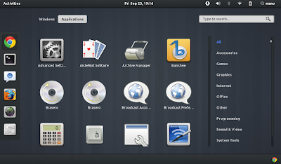
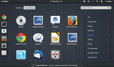
The dash functionality of both GNOME Shell and Unity are very similar, yet they are different. Unity dash is the first item of Unity launcher while GNOME Shell's dash along with the launcher itself is not very visible and somewhat hidden. Both can be activated by hitting the Super Key. Both of them loads fast, but searching is not(yet). Overall, I felt that Unity dash's search as slightly more faster. The applications menu(above screenshot) of GNOME Shell with that easy to navigate categories section definitely looks slicker.
As many complain, Unity's dash and GNOME Shell's activities window are not steps in the backward direction. I have been using Unity for around 6-8 months now and I simply can't go back to old drop-down menu style approach of GNOME 2.0. I wonder what is it that people are complaining about. If you don't like searching manually in either Unity dash or GNOME Shell activities, simple filter out the applications from categories, simple as that. An instant loading dash functionality could provide both Unity's and GNOME Shell's users a more robust experience though. And I am pretty sure that they are already working on it.
GNOME Shell is Ready for Prime Time
That's the easiest way to put it, GNOME Shell is ready for deployment. Even after taking into account a number of minor bugs like the ones we mentioned above, there are many significant improvements overall and GNOME 3.2 update is supposed to bring even more. And for now at least, GNOME Shell's Mutter window manager feels more stable and integrated than Unity's Compiz. So if you ask me, I would say the first thing to do after installing Ubuntu 11.10 is to try out latest GNOME Shell. Stay tuned for more Unity and GNOME Shell related posts.

Posting Komentar